Help Guides
Surveys
Getting Responses
Managing Responses
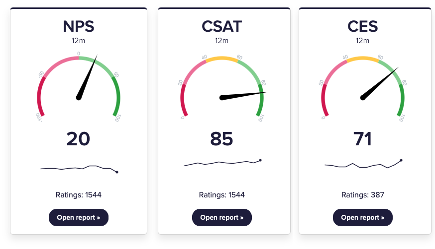
CustomerSure supports three standard customer experience metrics:
These metrics are derived from customer feedback scores. They summarise sentiment at a high level and make it easier to track trends and compare performance — but they do not explain why customers feel the way they do.
This page explains how metrics behave in CustomerSure, how to interpret them correctly, and how they fit into the wider reporting model.
If you need a broader overview, read Reporting basics first.
What are CX ‘metrics’ in CustomerSure?
Metrics in CustomerSure are:
- calculated, from rating question scores
- high level, designed to show direction and change over time
Metrics are not:
- diagnostic tools: use topics, topic sentiment and individual questions
- actionable without context
- suitable as operational targets
Metrics tell you overall, how are things are going? Topics and comments tell you why.
How metrics are calculated
Metrics are calculated automatically from rating questions that are marked as measuring NPS, CSAT or CES.
Net Promoter Score (NPS)
NPS is calculated using the standard formula:
(% Promoters − % Detractors)
Where, on a 0–10 scale:
- Promoters = 9–10
- Passives = 7–8
- Detractors = 0–6
NPS always results in a score between −100 and +100.
Learn more:
Customer Satisfaction (CSAT)
CSAT is calculated as:
(% of positive scores)
What counts as “positive” depends on the scale used (for example, 4–5 on a 1–5 scale).
CSAT is intentionally flexible. That flexibility makes it easy to use — but also makes benchmarking meaningless.
Learn more:
Customer Effort Score (CES)
CES measures how easy or difficult an interaction was for the customer.
CustomerSure calculates CES as the percentage of low-effort responses, based on the effort scale used.
CES is best suited to transactional feedback, where the goal is to reduce friction and cost-to-serve.
Learn more:
Metrics across multiple surveys
You can measure the same metric across multiple surveys, journeys and touchpoints.
When you do:
- CustomerSure automatically combines the results in reports and dashboards
- You can still filter reports to a single survey if needed
You cannot measure the same metric more than once on a single survey.
Slicing metrics
Metrics can be sliced and compared by:
- location (site, region, area)
- staff and teams
- brand
- survey, customer journey or touchpoint
- labels
- segments (business or feedback)
- customer organisation
Slicing answers questions like:
- Where are scores improving or declining?
- Which parts of the business differ meaningfully?
- Is an issue localised or systemic?
See Segments for guidance on choosing the right slices.
Understanding what drives your metrics
High-level metrics like NPS, CSAT and CES are useful indicators — but on their own, they don’t explain why scores are high or low.
The Satisfaction river report helps answer that question.
It does this by correlating these top-line metrics with topic sentiment, to show which topics are most strongly associated with changes in overall scores.
It helps you understand:
- which topics are likely contributing to detractors, passives, or promoters
- where improving performance is most likely to move the overall metric
How the Driver report works
The Driver report looks at the relationship between:
- a top-line metric (NPS, CSAT or CES), and
- topic sentiment derived from customer comments
It then shows which topics are most strongly associated with higher or lower scores.
This allows you to move from:
“Our NPS has dropped”
to:
“Negative sentiment about call waiting time is strongly associated with lower NPS scores”. Let’s start looking at the customer comments to see how we fix that.
Correlation vs Causation
The Driver report shows correlation, not proof of causation.
That means:
- it highlights likely drivers, not guaranteed causes
- it works best as a way to prioritise investigation
- it should always be read alongside real customer comments
Turning drivers into action
The Driver report is most powerful when used as part of a loop:
- Use metrics to spot where performance is changing
- Use the Driver report to identify likely drivers
- Read the underlying feedback to understand what’s happening in practice
- Assign ownership and fix the root cause
Metrics show that something is happening. Drivers help you understand where to act.
Common mistakes to avoid
Using metrics as targets
Metrics respond to behaviour — they are not behaviour themselves.
Setting targets like “NPS must be +60” encourages:
- score-chasing
- survey bias
- undesirable behaviour in front-line teams
If you target (or worse, incentivise) a high-level metrici, it’s likely your teams will hit it, but it’s less-likely that customer satisfaction will improve in a way which impacts your bottom line.
Over-interpreting small movements and samples
Small changes are often noise. If you, as a CX leader, aren’t sure why a score is moving in the direction it is, always sanity-check:
- sample size
- time range
- report segmentation
How metrics should be used
Used well, metrics are:
- a health indicator
- a way to prioritise attention
- a shared language for senior stakeholders
Used badly, they become:
- vanity numbers
- blunt targets
- a distraction from fixing real problems
Metrics are the start of the conversation, not the conclusion.
What to read next
- Understand why scores move: → Topics and sub-topics
- Learn how to slice responsibly: → Segments
- Compare scores across the business: → Compare scores across segments